- TABLES
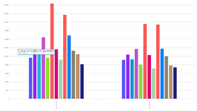
- BAR CHARTS
- DENSITY
- GRAPHS
- PIE CHARTS
- HEAT MAP
- TRACKING MAP
- WEB
- DATABASE INTEGRATION
- DEMO VERSION
- LICENSE
- TABLES
- BAR CHARTS
- DENSITY
- GRAPHS
- PIE CHARTS
- HEAT MAP
- TRACKING MAP
- WEB
- DATABASE INTEGRATION
- DEMO VERSION
- LICENSE
TABLES
TABLES
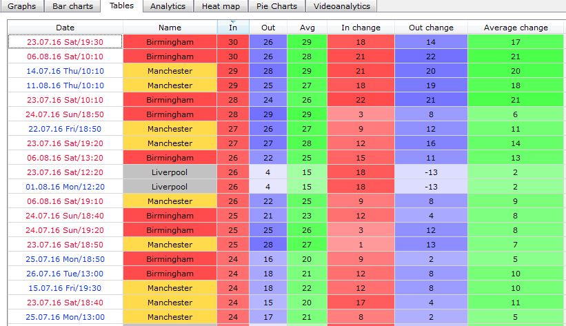
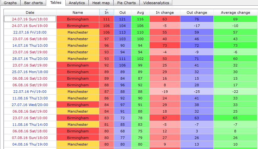
Tables are easy to sort by different colums which provides understanding peak values and hours, minimums and maximums of visitors flow.
The huge advantage of tables is that data can be with no effort exported to HTML, CSV or EXCEL for its further processing and analyzing.
Any row can be marked with a tag or comment, so we are sure you will not forget when you started an effective marketing campaign.
Output:
- Years-Year-Months-Month-Days-Day-Hours-Hour-10minutes
- Sorting any column
- Displaying every available counter
- Instant compilation which does not depend on the number of counters
- Export to EXCEL, HTML
10 minutes
Hour
Days
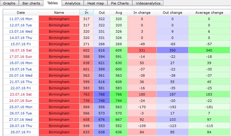
Want to sort a column? Not a problem!
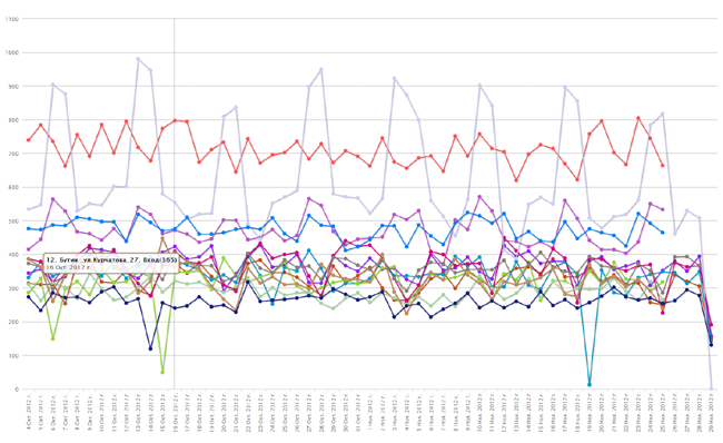
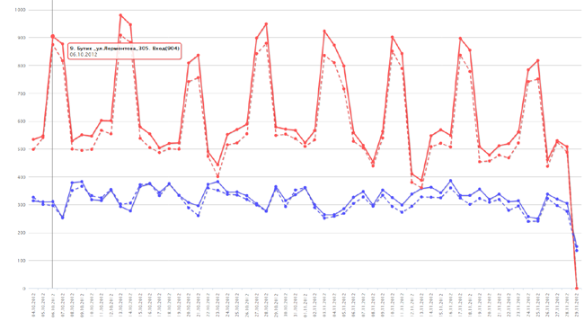
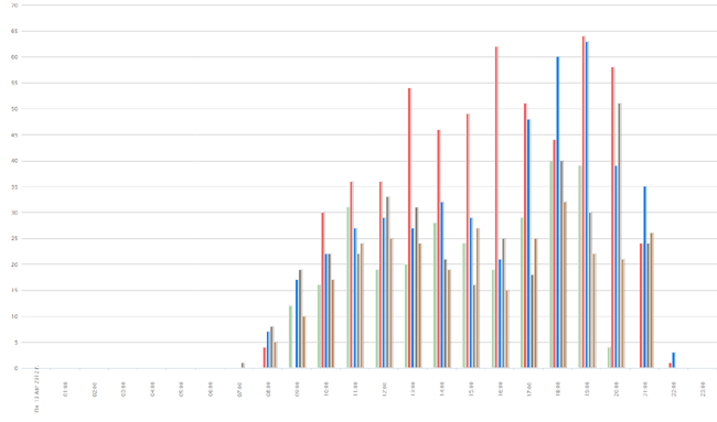
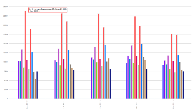
BAR CHARTS
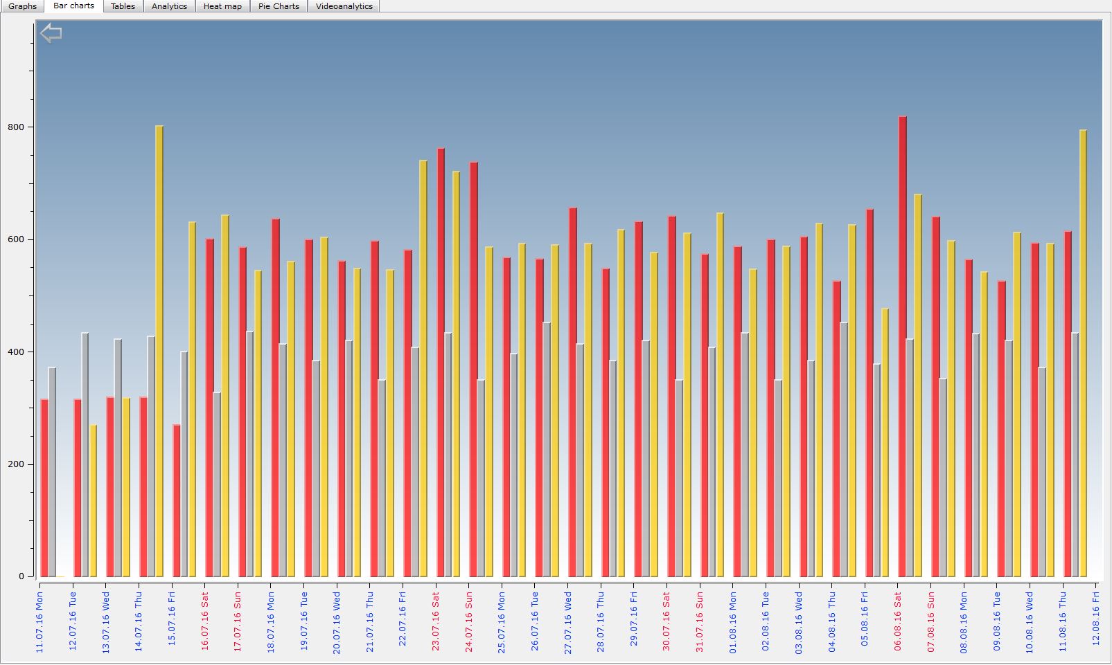
BAR CHARTS
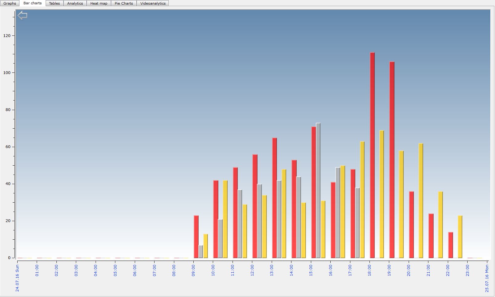
The report shows the dynamic of visitors flow with the help of bars of different height which can help to detect raises and falls of traffic.
The report can display data for the following time spans:
Years-Year-Months-Month-Days-Day-Hours-Hour-10minutes
The data has a clear structure so the system can immideately display statistics of the whole company or country, city or store in any time span.
It's a useful marketing instrument to find out the trends among big data and to compare different stores in one report.
Day
Days
DENSITY
DENSITY
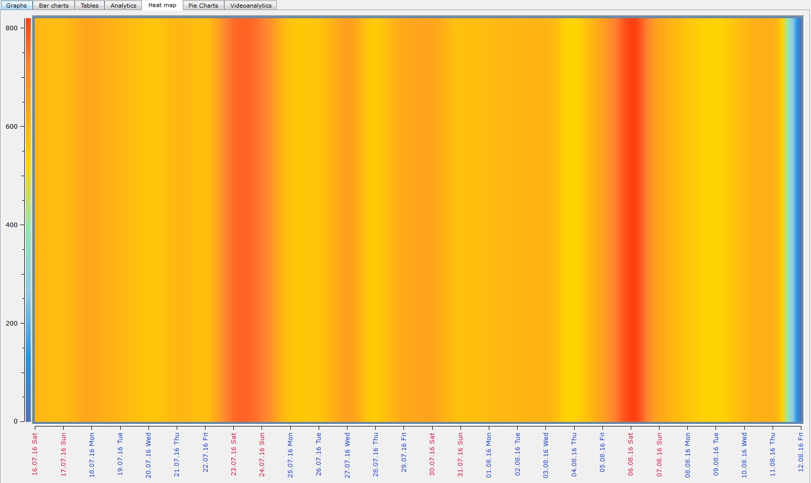
Density is a unique patented report that allows to determine trends in visitors flow and use this information to make a forecast on the next period footfall for both - single stores or the whole company. The report also shows your cold and warm days - so you can easily find out which days or hours have to be treated with special attention.
For marketing purposes this report will figure out general visitors trends by laying data on the same time span for different periods. By means of this the heat map will show the average dynamic of visitors flow for 24HOURS, WEEK or YEAR.
The data has a clear structure so the system can immideately display statistics of the whole company or country, city or store in any time span.
So, how does the heat map work?
In this map we can see the hot days (red) and the cold days (green-blue). We realise that Saturdays 07/23 and 08/06 are the days with the highest attendance and we need to find out the reasons of that to be experienced for further periods.
Days
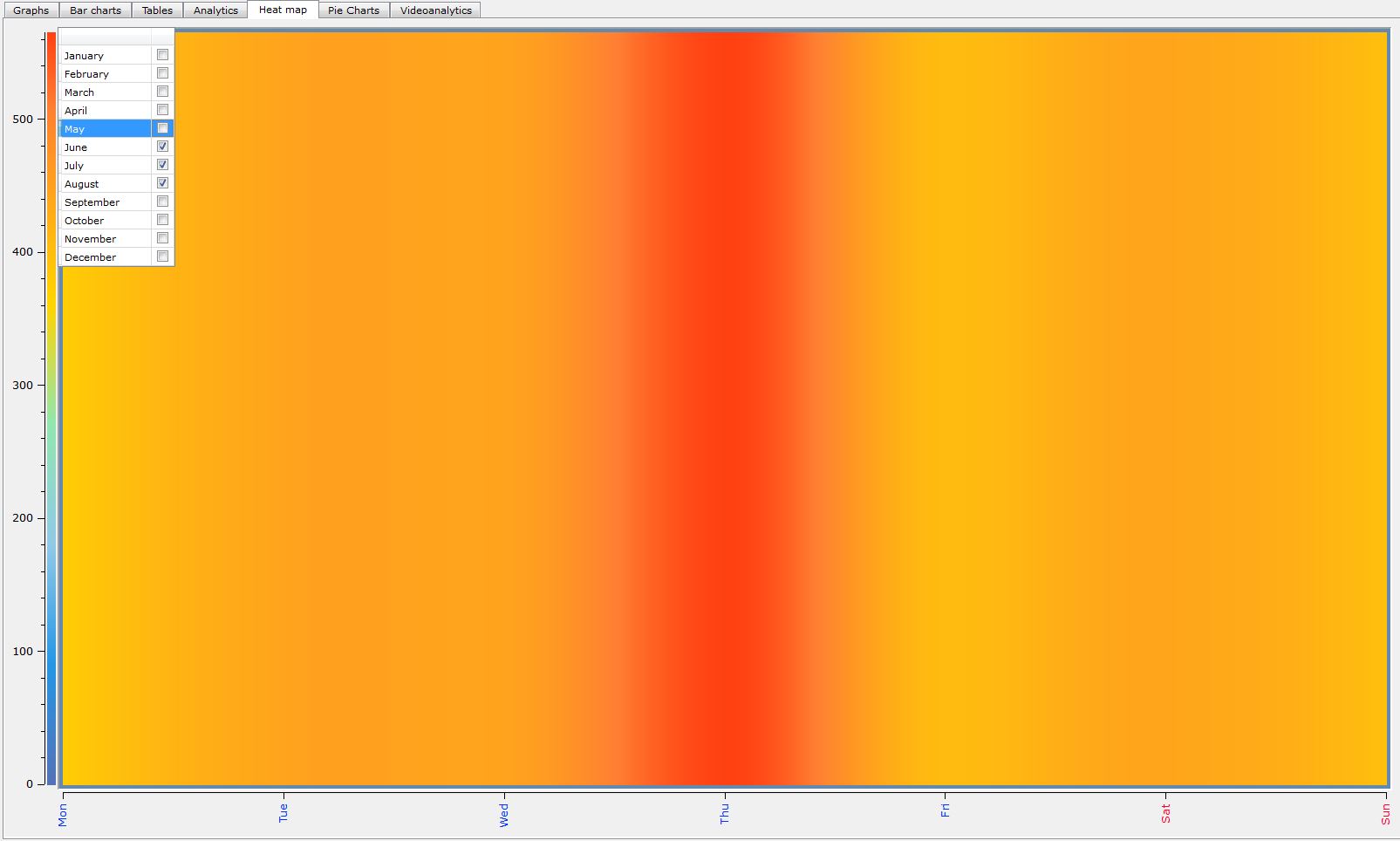
Now lets turn to the average week attendance of summer period.
We see that Thursdays are bring the highest visitors flow - and that means we have to increase efforts to maintain the best service: increase the operating time and pull some extra personnel.
Fridays are showing lower traffic comparing to other days and we need to attract more visitors with different marketing activities.
Week
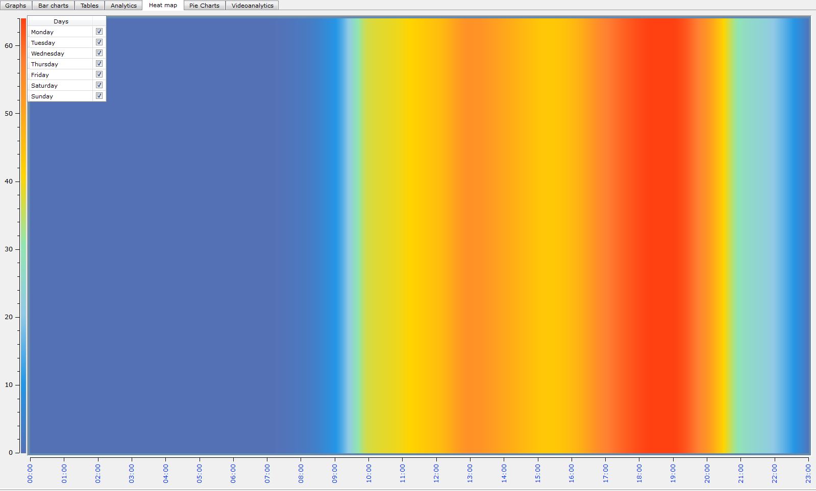
One more interesting report that might be rather useful - the average day attendance of a year.
From 5 p.m. to 8 p.m. we see the highest flow - extra efforts have to be made.
At 10 a.m. and 3 p.m. - there is low traffic - we can use this time to make some preparations for the next days.
Day
GRAPHS
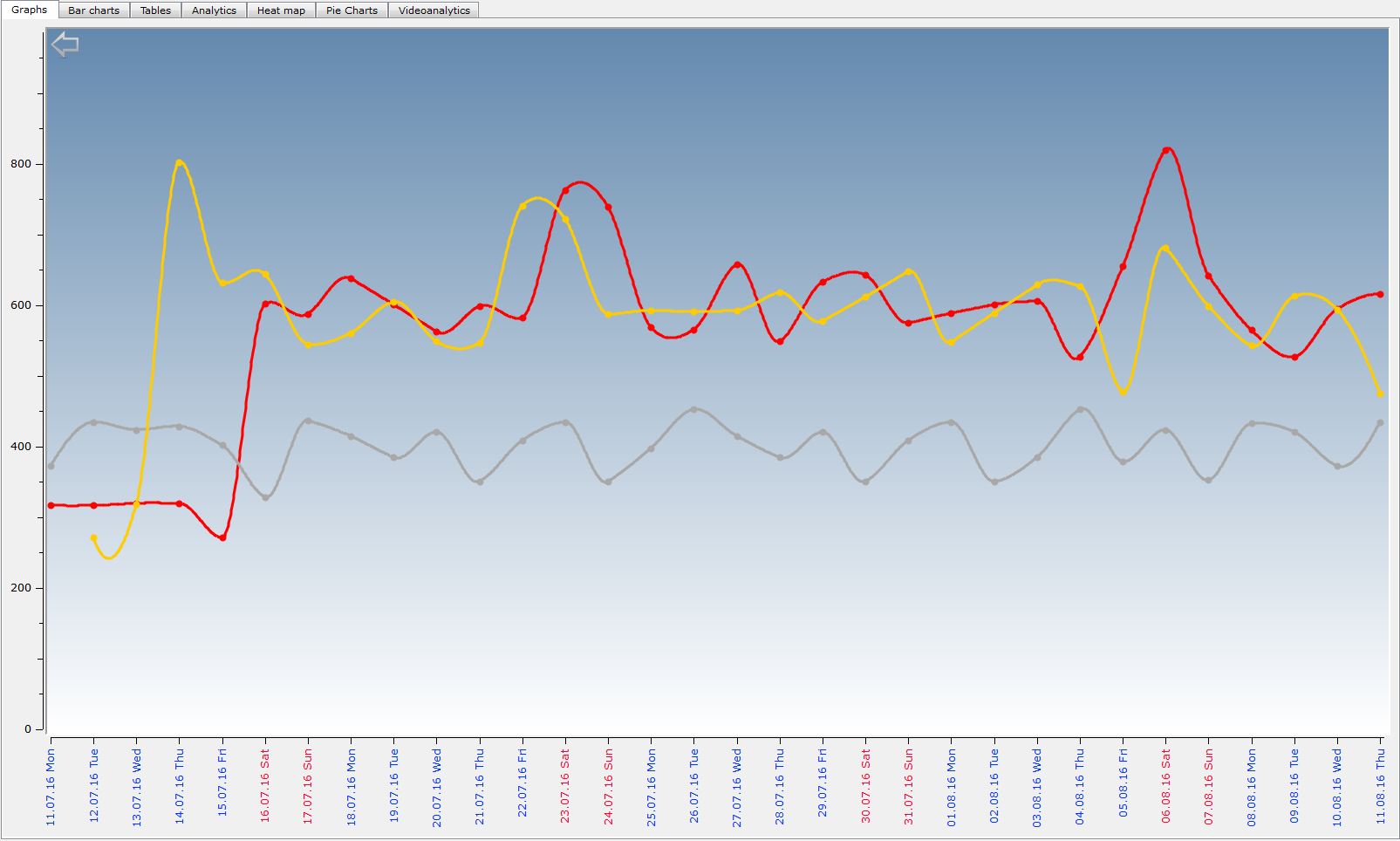
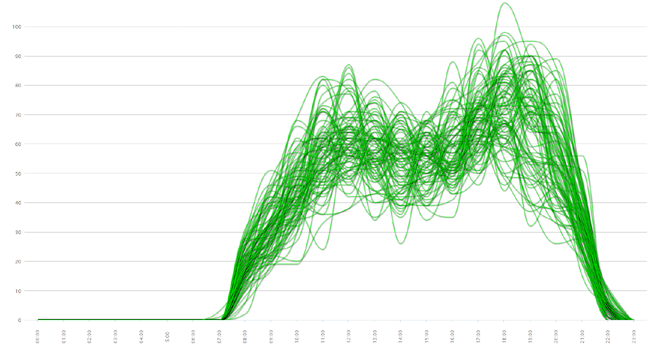
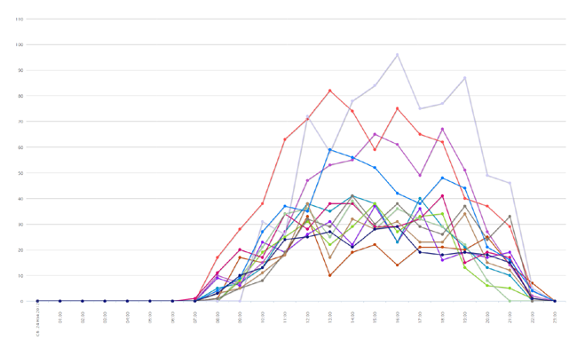
GRAPHS
Graphic report can show attendance trends through different periods of time - years, months, weeks or days. It helps to estimate the relative dynamics of customer flow for marketing purposes.
You can display all counters at once all select individual objects and display it in a different time scale.
The report allows you to display data in increments of:
Years-Year-Months-Month-Days-Day-Hours-Hour-10 Minutes
Graphs show data devided into different geographical areas. For example, you can immediately get information about the whole company or separately about the Europe branches or single country, single city, single store.
Graphic report is dynamic and can quickly respond to your inquiries and switch between different ranges of data.
Instantaneous calculation on numerous counters of 100 and more.
Day
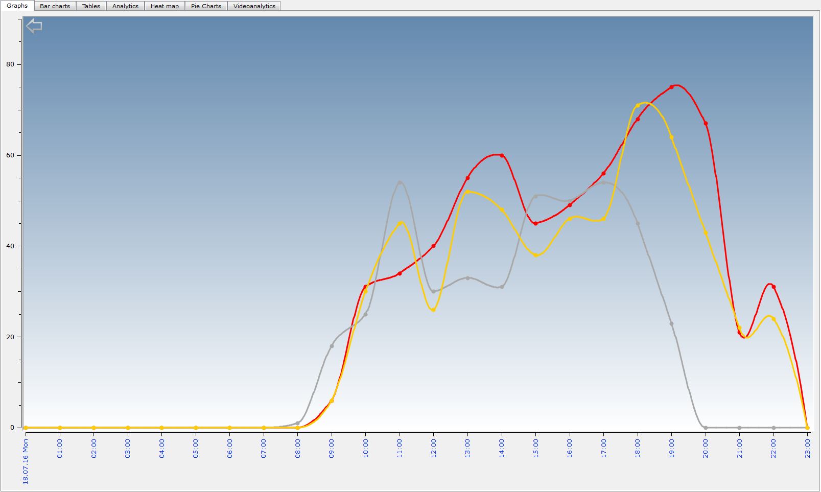
Days
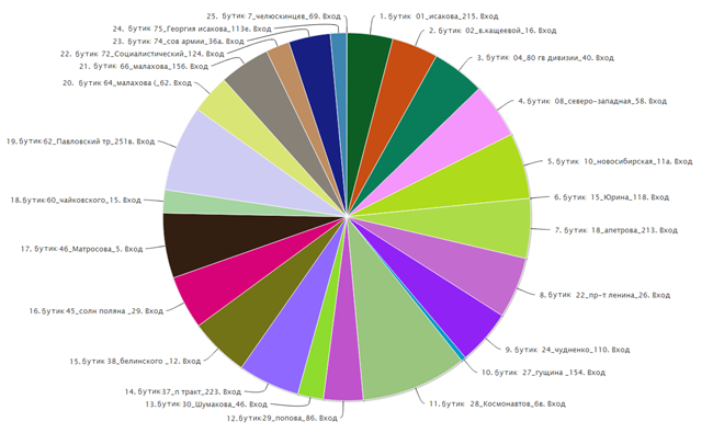
PIE CHARTS
PIE CHARTS
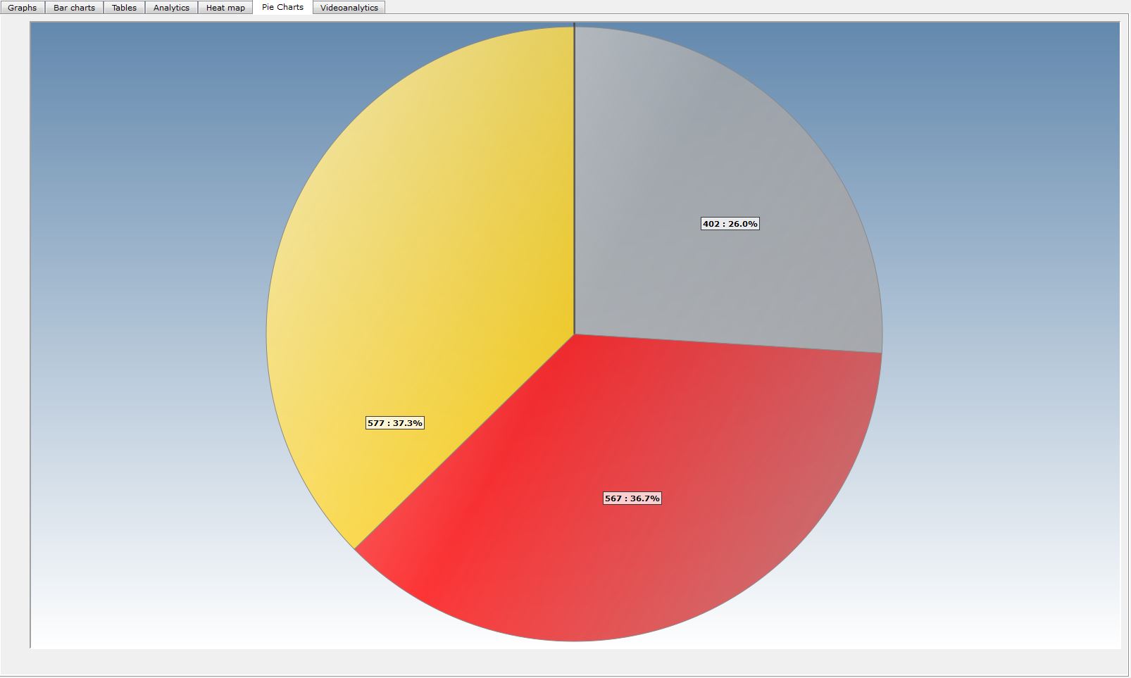
The report shows the attendance in a circle with automatically sorted segments.
In marketing purposes this report determines the trends among huge volums of data by visual comparison. The fact that data is displayed in segments significantly simplifies the perception and decision making.
PIE CHARTS WITH TIME SPANS DAY-MONTH-YEAR
HEAT MAP
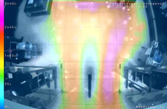
HEAT MAP - feel the warmth of your customers
Using the most modern and powerful processor allowed MegaCount create a device that not only provides the most accurate counting, but also monitors the movement of the customers.
VideoCount 3D ASSIS can show how your visitors' flow distributes, and how each customer moves. This information helps companies to make a huge step towards their customers and to reach a new level in their relationship. By studying the psychology of your buyers you can adjust the factors that affect the growth of traffic. You are welcome to create the most effective marketing strategy which is thoroughly thought-out minding every single aspect of your store, e.g. lightning colors, display positioning, etc.
MegaCount equipment is designed not only to keep statistics of outlets attendance, but primarily in order to achieve good results in studying the psychology of your visitors and efficient management of the whole company.
TRACKING MAP
It displays the average statistical movement of visitors.
Tracks show the direction.
The color spectrum indicates the number of visits at the point.
It defines the movement path of visitors to the facility, such as along windows or calculations.
The report can be used by marketers and merchandisers to identify the most effective areas to accommodate the tradable goods, as well as to determine what products the visitors are interested more than others. It can also be used to assess the overall attractiveness of the shopping premises
![]()
WEB
WEB ANALYTICS
MegaCount software consists of two elements:
[1] MegaCount WEB - analytical package that allows to work with processed data with a web browser.
[2] MegaCount STATISTICS - powerful software with professional reports.Click for details
MegaCount people counting system can be equipped with analytical Web module [MC-WEB] that allows to monitor and process data with a web browser and does not require installing any special software.
- Ability to estimate the attendance at any time
- Analytical data available on mobile devices: laptops, smartphones, tabs
- Control your business from any place of our planet
- Highest level of data security
- Protected connection
- Secure transmission
- Data processing and storage is organized on the company's server
- High-speed processing of large data
- Authorization
- Data is displayd ON-LINE
- Useful analytical reports with time spans YEATS-YEAR-MONTHS-MONTH-DAYS-DAY-HOUR-10_MINUTES
- Structured output with strong hierarchy
- Round-the-clock access
Pie charts are useful to estimate the attendance of chains
The unique and patented Ufatech reports help to determine trends and issues
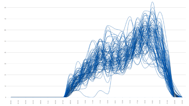
Day attendance graph of every store of the company
Days attendance graph of the whole company
Incommers and Outgoung traffic of any counting area
Bar charts to analyze attendance peaks
24-hours bar charts of several stores
Any time periods available to display
DATABASE INTEGRATION
DATABASE INTEGRATION
- Displaying every counting area in a counting network
- Binding to the geographical location of stores and facilities
- Binding counters to stores
- Calculation for time spans YEAR-MONTH-DAY-HOUR
- Conversion level calculation
- Attendace binded to the revenue and checks
- Export to pdf, html, xlsl and other
- Report printing
- Columns calculation


